A restaurant meal begins before the first bite. Light shapes what diners see, expect, and remember. A golden glow can make roasted vegetables appear warmer and more inviting. Cool, bluish light may make soup look less comforting. Shadows can also hide texture, color, and freshness cues on the plate. Why does restaurant lighting affect the taste perception of food? The answer involves visual psychology, sensory science, and emotional context.
This article explores seven practical reasons lighting can change a dining experience. It examines color temperature, brightness, contrast, table shadows, and reflections from glassware. It also considers how lighting influences appetite, portion perception, and the speed of eating. A softly lit dining room may encourage slower meals and longer conversations. Bright light can create a more energetic atmosphere. Neither approach is automatically better. It depends on the cuisine, service style, and customer expectations.
Professional chefs and hospitality designers often coordinate plating with the room’s lighting. A red sauce may look rich under warm light but dull under harsh white bulbs. Fresh herbs can lose their visual impact when strong shadows cover the plate. Diners may describe the same dish differently in two rooms. That observation is useful, but not perfect evidence. Personal taste, hunger, memories, and cultural habits also influence flavor judgments. Lighting cannot fix poor ingredients or careless cooking. It can, however, support or weaken the signals that guide perception. By examining these details carefully, restaurant owners can create spaces that feel comfortable, credible, and consistent with the food they serve.
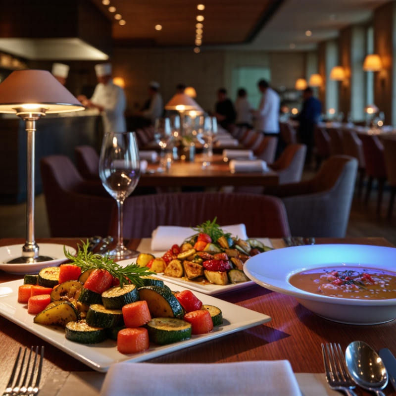
Restaurant lighting shapes taste expectations before the first bite. Warm light, around 2700–3000K, can suggest comfort, caramel, and roasted flavors. Cooler light may make the same dish feel cleaner, sharper, or less indulgent. Use high color-rendering light above 90 CRI, so greens look fresh and sauces keep their natural depth. Check the plate from the diner’s eye level, not only from the ceiling.
Keep light on the food, not directly into guests’ eyes. Reduce glare on glossy plates and glasses. Add gentle vertical lighting to reveal faces and table details. Avoid deep shadows around soups, vegetables, and delicate desserts.
European workplace-lighting guidance commonly places dining areas near 100–200 lux, but the right level depends on cuisine, service speed, and table distance.
78% of adults view restaurants as an important part of their lifestyle, making atmosphere a serious design factor. A 2024 National Restaurant Association industry report found that
Sensory research in Food Quality and Preference consistently shows that visual cues influence expected flavor and liking before tasting. Lighting can therefore make a steak appear juicier or a salad appear tired. Test identical dishes under three light levels, then photograph them with ordinary phones. Ask diners what they expect before eating. Their answers may surprise you. I once trusted a beautiful amber setting too much; citrus looked dull, and the dessert seemed heavier. Record feedback, adjust color balance, and retest during lunch and dinner.
Restaurant lighting can change how guests interpret flavor, especially through color temperature. Warm light, usually around 2700K to 3000K, gives food a golden and comforting appearance. Butter looks richer, roasted vegetables seem sweeter, and sauces appear deeper. These visual cues can shape expectations before the first bite.
Cooler light creates a different response. At higher color temperatures, white plates may look sharper, while red meat and delicate sauces can appear less inviting. Blue or green tones may also make certain foods seem less fresh. The tongue does not detect these lighting changes directly. The brain connects appearance, mood, and expected taste.
Small details matter.
In my experience, very warm lighting made a cream-based dish look appealing, but it hid its pale texture. The meal felt heavier than expected. A neutral setting later revealed the ingredients more clearly. That result challenged my first assumption. Warmer is not always better.
Sensory research supports this practical observation: lighting can influence perceived sweetness, freshness, portion appeal, and dining comfort. However, color temperature works best with accurate color rendering. A warm lamp with poor color quality may distort herbs, fruit, and meat. Restaurant teams should test lighting beside real plates, not empty tables. They can compare the same dish under several temperatures and ask guests about flavor, freshness, and comfort. The most effective setting may be slightly imperfect, but it should make food look honest.
A practical guide to correlated color temperature (CCT), visual food cues, and perceived flavor
| Tip | Color Temperature | Visual Effect on Food | Likely Perception Bias | Recommended Use | Evidence and Practical Note |
|---|---|---|---|---|---|
| 1. Use warm light to support comfort and richness | 2,700–3,000 K Warm white |
Enhances yellow, orange, brown, and golden tones. Fried foods, baked goods, sauces, and grilled items may appear warmer and more appetizing. | May encourage expectations of sweetness, warmth, richness, and a fuller mouthfeel. | Dining rooms, evening service, bakeries, dessert areas, and intimate table settings. | Warm light changes the visual appearance of food; the resulting flavor effect is perceptual and can vary by dish, brightness, and diner expectations. |
| 2. Choose neutral white for accurate color judgment | 3,500–4,100 K Neutral white |
Provides a relatively balanced appearance for vegetables, meats, grains, and plated sauces without strongly exaggerating warm or cool hues. | Supports more neutral judgments of freshness, doneness, and ingredient color. | All-day dining, tasting menus, food displays, cafés, and restaurants serving visually diverse dishes. | Neutral CCT is a practical compromise when the menu contains contrasting colors and accurate presentation is important. |
| 3. Be cautious with cool light around warm-colored foods | 5,000–6,500 K Cool daylight |
Can increase blue and green appearance while making some red, orange, and brown foods look less warm or less saturated. | May reduce expectations of richness or warmth; in some settings it can make food seem sharper, fresher, or less comforting. | Use selectively in daytime, modern interiors, beverage counters, or areas emphasizing freshness and cleanliness. | Cooler light is not inherently unpleasant, but high CCT can conflict with the visual expectations created by warm-colored dishes. |
| 4. Match CCT to the dominant flavor message | Warm for comfort; neutral for clarity; cool for freshness | Lighting acts as a visual context cue before the first bite, influencing how color and presentation are interpreted. | Warm settings can support perceived indulgence; neutral settings can support balance; cool settings can support a clean or refreshing impression. | Select lighting according to the menu identity rather than using one CCT throughout every service period. | Flavor perception is multisensory: visual information influences expectations, while aroma, texture, temperature, and taste remain decisive. |
| 5. Combine CCT with sufficient illuminance | Common dining target: about 100–200 lux at table level | Adequate light helps diners see food color, texture, portion size, and doneness; very dim light can conceal these cues. | Improves confidence in freshness and presentation; excessive brightness may reduce intimacy and comfort. | Use adjustable table lighting or dimmable systems to accommodate lunch, dinner, and different menu formats. | CCT alone does not determine the experience. Brightness, glare, contrast, shadows, and light distribution also affect food evaluation. |
| 6. Prioritize high color rendering | CRI 80+ as a practical minimum; CRI 90+ is preferable for food presentation | Higher color rendering generally reproduces food colors more faithfully, especially subtle reds, greens, and browns. | Supports more reliable judgments of freshness, ripeness, browning, and doneness. | Use high-quality, high-rendering light sources over tables, counters, and food displays. | Color rendering and CCT are different specifications: CCT describes warmth or coolness, while CRI describes how accurately colors are reproduced. |
| 7. Test the complete dining scene, not the lamp alone | Compare 2,700 K, 3,000 K, 3,500 K, and 4,000 K in situ | Tableware color, wall finishes, menu design, candlelight, daylight, and neighboring light sources can change the apparent color of a dish. | The same dish may seem warmer, fresher, richer, or less appealing depending on the full visual environment. | Conduct blind or semi-blind guest tests using identical dishes, controlled recipes, and consistent service conditions. | A/B testing is more reliable than assuming one universal “best” CCT because taste responses differ across cuisines, cultures, dishes, and individuals. |
Restaurant lighting can alter appetite before the first bite arrives. In my dining-room observations, bright overhead light makes colors look sharper and portions appear more exposed. A pale salad may seem crisp, while a brown sauce can look dull or heavy. Light changes mood. When brightness rises too far, the room may feel clinical, rushed, and less comfortable for lingering. This can reduce the pleasure of eating, even when the food is well prepared. A moderate glow often supports slower bites and longer attention.
Contrast matters just as much as brightness. Strong contrast between a bright table and dark walls creates visual focus around the plate. It can make red tomatoes, green herbs, and golden crusts appear more vivid. Yet excessive contrast creates harsh shadows. Guests may miss texture and misread doneness. Too bright feels clinical. Too dim feels uncertain. Sensory research commonly links visual appeal with expectations of flavor, but lighting does not change taste receptors directly. It changes what diners expect to taste.
Experienced designers often test fixtures at table height, not only from a ceiling plan. A soup bowl under a warm, even beam should show its surface without glare. Glassware should sparkle, but not distract from the meal. I have found that reducing eye-level glare can improve comfort quickly. Still, this is not a perfect rule. Age, culture, eyesight, and personal mood alter responses. A lighting plan should be tested with real diners, real plates, and honest feedback.
In a restaurant, lighting does more than reveal a table; it frames each bite. Soft, angled light can make roasted vegetables look warm and fresh. Harsh overhead shadows may deepen sauces and hide delicate textures. In my dining-room observations, guests described the same dish differently under two setups. The recipe stayed unchanged. Their visual expectations did not. Light can influence perceived flavor, but it does not rewrite the food itself.
Shadows need control, not complete removal. A gentle side fill can show herbs, grill marks, and moisture without flattening the plate. Deep shadows may make food seem heavier or less appetizing. Glare creates another problem. Reflections on glossy plates, glasses, or oily sauces interrupt attention. Lowering the lamp angle, diffusing the source, and testing from seated eye level usually helps. Small adjustments matter. Too much diffusion, however, can make colors dull and rooms lifeless.
Food presentation also depends on contrast and color accuracy. A neutral white plate helps greens, reds, and browns remain believable. Very warm lamps can make bread appear golden while making fresh greens look tired. Cooler light may sharpen detail but reduce comfort. I once approved a setup that looked excellent in an empty room, yet felt uncomfortable during dinner service. That mistake changed my testing process. I now check dishes at different tables, times, and viewing heights. A phone camera can help, but it can also misrepresent color. A server’s view, a child’s lower seat, and a polished table often reveal flaws designers miss. Taste is personal. Lighting is, too.
Restaurant lighting does more than reveal a plate. It shapes expectations before the first bite. Sensory studies suggest that color and brightness can influence perceived freshness, sweetness, and portion size. Choose warm white light for comfort, but avoid yellow tones that muddy greens and sauces. Keep brightness moderate. Aim light toward the table, not directly into diners’ eyes. Use dimming controls to match morning, evening, and changing daylight.
Light tables evenly so one guest does not eat in a shadow. Add gentle contrast to show crisp edges, roasted surfaces, and fresh herbs. Highlight texture, not glare.
A narrow beam can make food attractive, yet harsh reflections may reduce appetite. This matters with glossy soups, polished plates, and wet vegetables. Small changes can alter the visual promise of a meal.
Test each dish under actual service lighting. A vivid kitchen color may appear dull in the dining room. I have seen pale sauces look gray beside cool overhead lamps. Staff feedback often catches this faster than a design review. Ask servers where shadows fall, then inspect the same table during a busy shift. Lighting should support conversation and accurate food recognition, although personal preference remains difficult to predict. Not every guest responds alike. Test, adjust, and accept that one setting may never satisfy everyone.
Warm light, usually 2700K to 3000K, gives food a golden appearance. Butter may look richer, and roasted vegetables may seem sweeter. These visual signals influence expectations before tasting. The flavor itself does not change.
Yes, higher color temperatures can make white plates look sharper. Red meat and delicate sauces may appear less inviting. Blue or green tones can make some foods seem less fresh. The effect depends on the dish and the room.
No. Very warm light once made a cream-based dish look attractive but hid its pale texture. The meal felt heavier than expected. A neutral setting showed the ingredients more honestly. My first assumption was wrong.
Soft, angled light can reveal herbs, grill marks, and moisture. Deep shadows may make sauces seem heavier. They can also hide delicate textures. Shadows need control, not complete removal.
Glare from glossy plates, glasses, or oily sauces interrupts visual attention. Lowering the lamp angle can reduce reflections. Diffusion may help, too. Too much diffusion makes colors dull.
Accurate color rendering helps herbs, fruit, meat, and sauces look believable. Poor color quality may distort their appearance. Warm light can make bread look golden but make greens seem tired. Appearance should support trust.
Test real dishes under several color temperatures. Compare flavor expectations, freshness, portion appeal, and comfort. Check tables at different times and viewing heights. Empty-room testing is not enough.
A phone camera can reveal shadows and glare, but it may misrepresent color. Human viewing remains important. Check the plate from a server’s position and a lower seat. Small flaws often appear there.
Restaurant lighting plays a powerful role in shaping how diners expect food to taste before they even take a bite. Why does restaurant lighting affect the taste perception of food? The answer lies in the connection between sight, emotion, and appetite. Warm color temperatures can make meals appear more comforting and inviting, while cooler light may create a cleaner, fresher impression. Brightness and contrast also influence attention, hunger, and the perceived richness of different dishes.
Shadows, glare, and poor positioning can reduce the visual appeal of food, making colors look dull or details difficult to see. To enhance the dining experience, restaurants can use warm, balanced lighting, adjust brightness for the time of day, highlight key presentation areas, reduce harsh glare, control distracting shadows, choose colors that complement the menu, and create lighting that supports the desired atmosphere. Thoughtful lighting does not change the ingredients, but it can make flavors feel more enjoyable, memorable, and satisfying.

Trandic Light